Thursday 30 April 2015

Thursday Talk

Tuesday talk and portfolio review

Dave Sedgwick 

Portfolio - thin the herd, some of my work is good some mediocre, present the best of yourself.
Create one consistent portfolio, each one should lead you somewhere and show a good side of you.

Nigel Hurlstone - Thursday talk

Moved away from his normal field then progressed back. With the development process actually helping him in his original field of study.

Note: everything informs your work. It collects to make a piece of work. 

Only once you stand back do you notice that.

Change in scale, change perception, change meaning

Strip away the rhetoric post reflection

Note: must direct your work  but accept the everyday influence as well.


Tuesday 14 April 2015

Responsive Design Test - Illustrative Exploration Into Graceful Degradation and Canvas Anticipation

Write up of questions:

Answers Nick - Blue / Sam - Red
  • Do you feel test 1's original large scale illustration has the same look and feel as test 1 small scale illustration?
Yes. The second version said the same thing but in a more condensed way.

I think it had the same feel, but the look was slightly different as some elements needed to be compressed.
  • Do you feel test 2's original large scale illustration has the same look and feel as test 2's small scale illustration?
It had the same look and feel, but the message was in two parts. Because in this version I knew it would be in two parts before I did it.

Yes, more so than test 1, as I used the larger scale images more as a sketchpad for the smaller one.
  • What elements did you feel were important when transferring the designs to a smaller canvas in order to make sure they maintained their look and feel?
The message is more important than the look and feel, so long as it was conveying part of the same story then it works.

I tired to consider key elements which optimised the theme. i.e. waves and bubbles, then culled the less relevant info like the large scale images.
  • When you downsized your illustrations to small scale, how did you feel the scale of the canvas affected your illustration? For both exercises rate out of 10 how important scale was. (10 being extremely important, 0 being not important at all.)
6     (no further additions)

8     In order to make the test make sense I had to consider how it fitted down into the smaller one. Where as I had more free rain on the larger scale, this meant I had to consider how the image and text interplayed more.
  • When you downsized your illustrations to small scale, how did you feel the orientation of the canvas affected your illustration? For both exercises rate out of 10 how important orientation was. (10 being extremely important, 0 being not important at all.)
10     (no further additions)

8       I had to stack the images in a way that made sense. i.e. placing a boat at the bottom wouldn't have made sense with fish above it.
    • Did you feel less constricted in test 1 than test 2?   
    I was more constricted in test one because I didn't consider that it would be reduced down.

    In test 1 I could compose the space more freely
      • What effect did that have on the creative process?  
      The second version where I knew that it would be in two versions was more interesting. It gave me the chance to do a call and response.

      I felt the process became more linear and structured on the second test but the limitation gave me more to work with.
      • Did you feel you predetermined a simplified design for test 2's initial illustration in preparation for the scale of test 2's small scale canvas? 
      I knew that the style would have to work over two sizes. It wasn't restrictive. I just had to be flexible.

      I definitely had more consideration over how I would change the image.
      • How did the knowledge of the exercises outcomes affect test 2?
      I thought about two designs at the same time rather than just one.

      I feel the image made more sense.
      • Did that hinder or focus your creativity in any way?
      It was neither you have to be creative with the information you have in front of you. It's up to you how creative you are.

      I think it focused my creativity.

      Further Comments:

      This ain't over.

      I preferred working with the second image, but I think I would have liked it less if I hadn't used the larger scale image first.


      Notes during process:

      Test 1

      Nick decided to reduce the information and imagery. This left him with the most important elements left to him. By going through this process it is encouraging him to distill the creative idea to its base elements. This thinking is only required once the original illustration was done, leaving him free to be as creative as he likes initaially.

      Sam did the same but with less steructure applied to it, leaving him more free to fill the canvas both times. (omission: in test one he forgot the fact that it was an illustration and just doodled through it)

      Test 2

      Nicks test two has been created with elements that are not affected by scale and orientation. He has also ignored some of the tasks objective to suit the idea of working with two canvases.

      Sams test two seems to be as complicated as in test one. However, when working on test 2 large scale piece he has clearly thought about the length of the small scale piece due to the depth of the water.


      Notes after reviewing the process and participants answers.


      Monday 30 March 2015

      How to represent a responsive viewport in the real world...

      Illustrative exercise-

      Idea:

      Test should be done by an illustrator with no connection to web design.
      The test will be recorded on film.
      They should have no prior knowledge of the test.
      Illustrations should be done on a white board.

      Test 1

      Create a large, landscape area for them to draw in.
      Ask them to draw an illustration on a white board.
      The illustration can be of whatever they like but must contain certain things:

      Several separate elements.
      One headline
      One representation of a body of text.

      Once they have completed the illustration I will draw another area for them to draw in, this time the area will change the orientation and size of the canvas they have to draw on.

      They will be instructed to redraw the same illustration in the new area, whilst maintaining the look and feel of the original illustration.

      Test 2

      This test will then be repeated in exactly the same way but this time the illustrator with have the full disclosure of the exercise.

      They will then have 10 questions to answer:


      • Do you feel test 1's original large scale illustration has the same look and feel as test 1 small scale illustration?
      • Do you feel test 2's original large scale illustration has the same look and feel as test 2 small scale illustration?
      • What elements did you feel were important when transferring the designs to a smaller canvas in order to make sure they maintained their look and feel?
      • When you downsized your illustrations to small scale, how did you feel the scale of the canvas affected your illustration? For both exercises rate out of 10 how important scale was. (10 being extremely important, 0 being not important at all.)
      • When you downsized your illustrations to small scale, how did you feel the orientation of the canvas affected your illustration? For both exercises rate out of 10 how important orientation was. (10 being extremely important, 0 being not important at all.)
      • Did you feel less constricted in test 1 than test 2?  For both exercises rate out of 10 how constricted you felt. (10 being extremely constricted, 0 being not constricted at all.)
      • What effect did that have on the creative process? For both exercises rate out of 10 how creative you felt. (10 being extremely creative, 0 being not creative at all.)
      • Did you feel you predetermined a simplified design for test 2's initial illustration in preparation for the scale of test 2's small scale canvas? For both exercises rate out of 10 how simplified you felt the initial designs were. (10 being extremely simplified, 0 being not simplified at all.)
      • How did the knowledge of the exercises outcomes affect test 2?
      • Did that hinder or focus your creativity in any way?


      Woodwork - flexible frame

      Create a piece of wood with grid set holes that are drilled equal distances apart.
      Create a flexible wooden frame that can change size both on the horizontal and the vertical.
      Create website pieces that represent elements on a webpage:
      Logo
      Headlines
      Text
      Images
      Graphic elements

      These will be of varying size.

      Get people to create a website, test a few people with progressive enhancement and a few with graceful degradation.

      Ask them the same questions as above.

      Thursday 5 March 2015

      Introduction to practice

      What did you choose to research? / Why?

      I am continuing on my journey to understand the underlining principles of web design. My previous meanderings led me to examining how users navigate web environments, and why the conventions that are now commonplace influence their behaviours. I felt ‘Responsive web design’, was a good move on from my previous research as it is becoming more popular and is fast becoming the next convention to be adopted.

      The ‘responsive’ theory proposes that a webpages design should act as a fluid, shifting their shape and composition to accommodate differing screen size, orientation and resolution, hence being ‘responsive’ to the screen. My primary goal in practice 2 was to investigate this concept to see whether there were any pre-existing principles in place for design thinking like this that I could interrogate in order to form my own opinions and design method.

      What challenges did this present?

      The first month of this project was affected due to the intense time required to finalise the Digital Future exhibition and hand in.

      This idea of a responsive design seems straightforward enough but when you scratch the surface you realise that traditional design principles have evolved for thousands of years based on the idea of a fixed width/height canvas. The idea of a designers start point changing from canvas to the content goes against the grain for most design evangelist.

      Due to that fact, there is barely any guidance from designer when it comes to new design principles based on how to think and design responsively. Instead the challenge has been left to the developers to build the design system within the browser and modify as they build. This can make the process of taking the initial design through to a responsive build cumbersome, time consuming and clumsy.

      Did it evolve from original thoughts?
      My original idea was to see if I could create a design principle or mathematical formula to allow a design to be transferred from one format to another without altering the overall aesthetics of the webpage. Through my practical experiments, talks with fellow students and industry professional, as well as a great deal of thinking I realised there was no way to create a formula like this without the end result being monotonous. Instead I focused creating my own responsive philosophy or tenements that could be applied to individual design challenges in the hope that starting out with a responsively adaptable design would make the process of transferring to a developer more streamline and the end result more effective.

      Reflection of the process


      How did you begin?
      My research began with the Responsive Web Design by Ethan Marcotte, he was the first person to coin the term Responsive Design in relation to web design. He advocates 
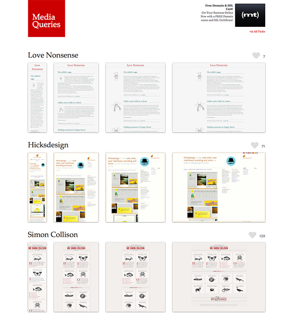
three rule for designing responsively, a flexible grid system, media queries (development term for code that recognises screen size) and flexible images. He originally borrowed the term from the architecture movement I decided to start from there looking at ….INSTERT QUOTES/BOOK REFERENCE

      He advocates that fixed width units will not work when creating a responsive design, instead he favours em’s, ratios and percentages as this way the design can move fluidly through the different style sheets attached to it.

      Using HTML and CSS, I explored the options open to a developer. I created a test using a square made up of individual circles, in my mind the square represented the overall design and the dots the individual elements within that design. I created three versions testing fixed width, magnification and responsive methods. With both the fixed width and magnification versions, even though the overall design was not affected, once you minimised the screen size past a point, areas were excluded and elements were either shrank too small or missing entirely. Where the responsive design differed is that it shifted focus from preserving the ideal of the overall design to making sure that the individual elements were kept intact. The designs hierarchy changes and the design becomes secondary and the content becomes key. This explained why it is favoured by developers and frustrates designers. What I wondered was is it possible to create a design in such as way that the elements and content are still key but the design personality is maintained across any screen sizes?

      This thinking led me to wonder about the design process itself and I realised I needed to explore how designers address the challenge of transferring a designs personality to a different dimension or orientation.

      I addressed this by writing a brief that was aimed at interrogating the two aspects of responsive design that are greatly contested methods of creating design solutions for multiple screen sizes. ‘Graceful degradation’ vs ‘Progressive Enhancement’ (GD - starting with a large screen design solution and removing elements as you design for smaller screens, such as; less images, less text, less content) (PE - starting with a small screen design solution and adding to the design for larger screens, such as; more images, more text, more content). Here for know as GD and PE

      I chose news websites as my subject matter as I thought they would offer the broadest range of content. I picked two ‘local news’ companies in need of a redesign; the Manchester Evening News and the London Evening Standard. I stripped them of their content and rebuilt them both. I decided to recreate the Standard using the 'GD' method, trying to keep to traditional newspaper layout. With the M.E.N I used the 'PE' method, using a contemporary news website design. Throughout the design process I recorded any alterations, marking down any change made to the elements within the page. What I found was that the 'GD' method aloud me more creative freedom and fewer limitation initially but required more thinking in order to maintain the design personality whilst adding functionality. It would also potentially create more problems and confrontation between developers and designers when it came to building due to the technical limitations. The 'PE' method felt it would be smoother to hand to a developer but initially hindered me creatively due to original dimensions and technological restriction. It also took much more thought because I was having to add design elements as I went, I felt I was designing three sites as opposed to one.

      Even though I prefer the modern design of the M.E.N site, when it came to the process of designing I preferred the 'GD' method. I found it aloud for more creative freedom and was easier to maintain the personality of the website in spite of scale. I realise this way of designing may create more conflict between designer and developer, but I see that as a positive as it also creates an back and forth dialogue between developers and designers that could potentially lead to a more creative outcomes.

      When discussing my finding in the group review week sessions it was suggested that I should leave my comfort zone and explore areas outside the vitual world of web design and take more risks. I also realised that I was heavily relying on my own opinion to form my thinking.

      My squares and circles test had left me with a question, when designing a site are developers/designers limiting themselves because they know how hard it will be to transfer the design? Is this why they prefer to use the 'PE' method? In order to truly test how designers transfer a designs personality and whether the knowledge of the task affects the original design. I wanted to set a test that would ask that question.

      In order to break away from the screen and answer this question, I set two students two challenges. In the first test I created a large, landscape area for them to draw in, I then asked them to draw an illustration, of what ever they wished on a white board. I told them it could be as intricate or as simple as they like and they had as long as they wanted to complete the task. The only rules were it had to have a theme, contain several separate elements, one headline and one representation of a body of text. After they had completed the illustration I drew a second boundary box this time the orientation and size was much taller and thinner. I asked them to transfer the design they drew into this area whilst maintaining the illustrations core content and personality.

      In the second challenge I asked them to repeat the exercise using a different theme, with full knowledge that they would be transferring the design to a smaller size.

      My hope was to find out if that knowledge of the task would affect how they approached the illustration and whether the outcome was changed because of this.

      My findings were…


      Initially, I looked at different materials and explored their properties in order to see if I could create a real world responsive design. However, I soon came to a conclusion; there are three substances in the universe, solids liquids and gases. Two of these are responsive, the problem is that a solid no matter how flexible it is can never be truly responsive to its surroundings. This posses an issue; if every real world weapon in a designers arsenal is made of a solid, (paper, clay, wood, stone, metal) there is no way to create a truly responsive design, instead I could only aim for a modular system that show the potential to be responsive. (Cover arse)

      Use this analogy for the bbc exploded website. Connect four, individual elements don't win the game it's the connection between those element, if you don't connect the right elements or other element get in the way you are bound to lose.


       The closest idea was a pieces of wood floating on a body of water where the vessels changed size. I realised there was no creative way of developing a responsive design within the real world the closest too it was to create an idea of a responsive design. An idea is fluid a solid is not.


      How did this beginning influence you?

      How did you record your research?
      I used pintrest to archive any relevant subject material I found on the web, I later printed these online findings off, highlighted any relevant information and edited the important finding into my sketchbook. Conversely, any offline reading material I wanted to reference, I used my experience of blogging to record the key references I found in books and at talks.

      Did you do any other research besides online and books?
      Lecture on anamophic design


      How did the lectures help?

      Which area of research did you focus on next?

      How did you begin practice 1?

      After that what questions did you want to explore?

      What methods did you use?
      Sketchbook - editing online research, mind-maps, brain storming with others, droodles, taxonomy of website design, word clouds, ordering importance through lists asking questions, visual representing findings, field testing navigation, posing questions to users of reddit and recording findings, designing wireframes.

      Computer based – blogging research, pintresting articles, infographics, designed mind maps, writing a brief, testing existing website, testing reddit, timeline, designing wireframes.

      Thinking – pondering idea, noting down ideas in jotter and on ipad, setting aside time to allow conscious to work, reflecting on practical design work

      How did you review your finding?

      Do you think you have found out anything interesting?


      Friday 20 February 2015

      New Blood Event

      Event D&AD New Blood

      Create a digital experience that demystify household energy efficiency and savings. 

      Note- For me it was more a chance to discuss user experience with industry professionals.

      Speaker Andy Gott - Field Works

      They are creatives for good - social entrepreneurs, donate by doing, do good for business/ uni.

      Good for nothing event - creatives lend their skills

      There is an importance with the ever changing pace of business that companies become more agile with their digital presence, they have to be able to relate and adapt to their consumers needs and wants.

      Fields works focuses their work on human behaviour. This doesn't just mean creating digital that is intuitive but also understand what human barrier are in place and how to over come them.

      Reactant to change
      The users issues - weather/ money/ complexities of modern life. By noticing these you can spot opportunities. 
      Existing patterns of behaviour

      Then design interventions to alleviate and understand.

      Users experience

      People should want to interact with what you offer.
      1. context- orginisation / purpose 2. Project Context - how does the project fit 3. Project Goals 4. Research the user - target audience and competition 5. Barriers - existing behaviours

      Work with the users needs and wants: 

      Can you make it worthwhile for the user?
      Can we build the audience with them?

      Design Principles
      What's important:
      - Let the principles evolve over time. ???? Ask about this?
      - Scope out the possibilities, there are, figure out how to implement them.
      - Distill the message, refine the outcome, make an environment users enjoy being in.
      - Create inspirational design but make sure it's realistic and usable:
      - Must have |  Should have | Nice to have
      - Frame the principles in a human way.

      Test real scenarios

      Stucture and workflow.
      Site map, user journey, check back on the user story, wireframe(use it for learning not designing), priorities elements over other elements ( ask about this), look and feel ( be playful, shake off research, process)

      Research - user / client. Planning - structure / Design principles. Design - Scope / Structure / Wire Framing Look and feel

      I asked him why there has been very little research done to look at creating responsive principles.

      “The industry is heavily split between designers and developers, even if your both you are generally more of one than another, that divide between development and design might be a cause but I have no doubt the insurge of new tech will make sure new principle are explored”

      You mentioned before that you should priorities some elements over others why is that? 

      " that way you know what can be lost across less content rich viewports. It also helps you realise what's actually important"

      From a design perpective, in terms of creating responsive mock ups do you think there is a better way do design? 

      "I can only tel you what we do which is design in the browser, usually mobile first and then create alternate versions for larger viewports. But, to be honest that's just our way not the right way."


      Andy - Love Digital

      At love our prime concern is creating stories that are well told, no matter whether hat online or off. Each campaign should act as one. We try to find the most interesting story and tell them in the most interesting ways.

      Don't search for executions, search for solutions.

      Disconnect with the physical, tech is intangible.

      Make it feel real to the audience, a digital space or landscape for the user to be emerged in.

      Need to have a genuine impact not just for the sake of it. What ever you design must have a purpose.

      Don't settle, interrogate your ideas.

      Story telling is a difficult process but when you do it right is the best way to capture your audience:

      Engage with the audience

      Facts - are your ingredients

      Stories - are your meal.

      Create a brand story. Make it the truth of the brand. What's the unique selling point or the hero? 

      Create multiple touch points. The more an audience is involved the more the buy into what your telling them.


      Tuesday 3 February 2015

      Antiphonal Geometry


      "In fleshing out his new canon of web design Mark pointed out that “[c]reating layouts on the web has to be different because there are no edges. There are no ‘pages’. We’ve made them up.”

      But this gives me pause. Because there are always edges. Do you scroll online? Of course you do. That’s edges for you. Don’t get me wrong. I understand what Mark’s getting at – that when we design for the web, we can’t rely on where those edges are, like a print designer can, because we don’t know what device the user has or what size their browser window will be."


      "In his book The Elements of Typographic Style, Robert Bringhurst touches on how proportions in print might be considered to work:


      The page is a piece of paper. It is also a visible and tangible proportion, silently sounding the thoroughbass of the book. On it lies the textblock, which must answer to the page. The two together – page and textblock – produce an antiphonal geometry.

      So what does Bringhurst mean by antiphonal geometry, a phrase, as I’ve already mentioned, that marries the musical (antiphony) to the spatial (geometry)? By stating that the textblock “must answer to the page”, the implication is that the relationship between the proportions of the page and the shape of the textblock printed on it embodies a spatial call-and-response, antiphonal geometry, that can be appealing or not."


      "Screens may come in many different sizes but, at least for now, they share some geometrical characteristics independent of size. Not only are they all rectangles, but those rectangles, those frames, conform to only a very few sets of proportions or aspect ratios.


      • The first of them, 2:3, shared by the iPhone up to version 4 and older iPod touches, but also devices like the Nook HD+.

      • Then there’s 3:4 (or 4:3 in landscape orientation) which covers devices like BlackBerrys, incarnations of the Kindle and, of course, the iPad and iPad mini. 4:3 is also the aspect ratio of older CRT monitors, and it’s the old PAL and NTSC TV standard.

      • At 3:5 there are many more smartphones, like the BlackBerry Z10, the Nexus 4 and the Nokia Lumia.

      • At 5:8 we’re definitely in tablet and small laptop territory, with Nexus 7 and 10 tablets, the Kindle Fire HD and MacBooks Air and Pro.

      • And finally with 9:16 we find the latest widescreen devices: iPhone 5; the Galaxy S III and Note II; many smartphones; while in landscape orientation are Microsoft’s Surface; iMacs and the Thunderbolt display; plus the Galaxy Tab and Kindle Fire. This is also the HDTV standard aspect ratio."
      "Back in September last year, Paul Robert Lloyd argued very eloquently in his A List Apart article for an approach to web design based in empathy for the medium, what it is and how it works. Such an approach might yield a true web aesthetic, developing organically from the web’s unique characteristics. I hope that my ideas about antiphonal geometry partake of that spirit."

      Monday 2 February 2015

      Notes responsive design principle

      The mediaqueri.es website offers lots of inspiration for some top-notch responsive web designs.
      The mediaqueri.es website offers lots of inspiration for some top-notch responsive web designs.
      Element 1 (base element) 100%

      Element 2 / 3 / 4 80% of the base element

      Element 5 / 6 55% of the base element

      Next problem is the shift positions between portrait and landscape layout / how the elements work as a whole.

      Give up control of the overall design and focus on the elements and the relationship between them.

      That way no matter the size/ format of the canvas you still have rule in place that the design adhere to

      https://m.youtube.com/watch?v=Epv2AYSrEhc

      When passing mock ups off to developers


      The idea of a style guide might work, the ability to clearly explain the importance of each element in a hierarchy, how they react to one another and how they alter dependant on canvas orientation.

      There would need to be a clear, percentage based, labelling system worked out where you had a base element that set the ratios of all the other elements. 


      "The Challenges a Responsive Web Brings

      Working with responsive design isn’t without its challenges. First of all, there are such a multitude of devices and screen sizes that we have to cater for. From extra-large to large screens, from small to mid (and everything in between) there’s a lot to think about. And, as I’m sure you already know being a developer, working with responsive design from the technical side of things can also turn nightmare-ish and be extremely difficult to handle."
      "Like with any project, the main things you need to think about with responsive web design are the content of the website, how this content fits into the design and how the content flows from page to page. You need to look at how the different design elements you have work together and ensure that everything feels cohesive and consistent.

      The difference with responsive web design is that you also need to think about how all of this works from one size to another, whether that is width or height based. You need to think carefully about how all of this translates to a smaller or larger screen and how all of your design elements, your content flow and everything else works. You need to keep the experience consistent, no matter the size of the website.Maybe you could modularise the design and try and create a base element that is pertinent to the other elements"